Internal Portal Redesign for an Insurance Company
Context
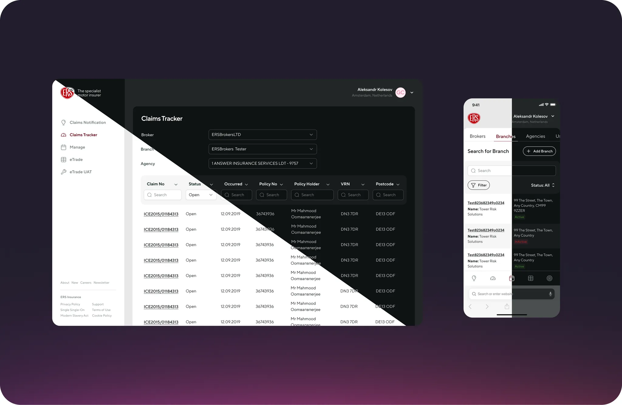
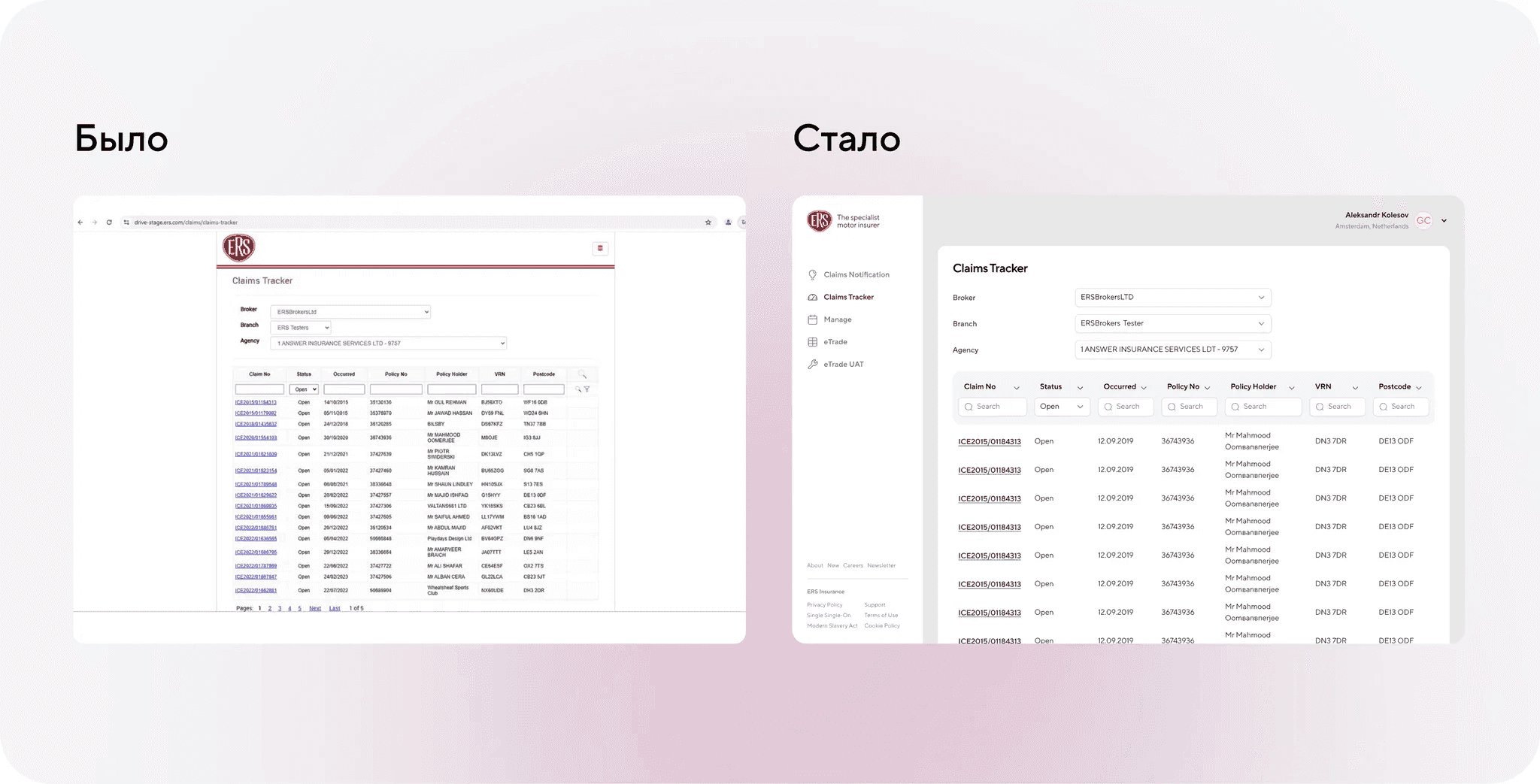
An insurance company relied on an internal portal for day-to-day work. Over time, the interface became visually outdated and no longer aligned with the company's updated brand style. There was no mobile version at all — users were tied to their desktops.
Problems
- The visual style no longer matched the company's current branding
- UI elements and typography were small and hard to read — especially problematic for users working with large amounts of data
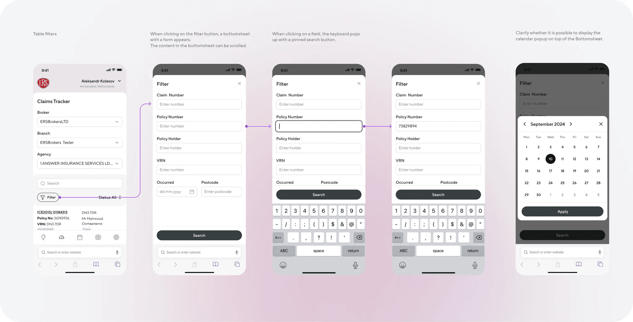
- No mobile version existed, limiting access to the portal outside the workplace
- Several key scenarios were missing from the interface
What I Did
Web version redesign
Updated the visual language to align with the company's new brand style. Increased the size of UI elements and text for comfortable use during long working sessions. Designed and added missing user scenarios. Added dark mode.
Mobile version from scratch
Designed a mobile version covering nearly the full functionality of the desktop portal. Mapped out core user scenarios for a mobile context. Added dark mode.
Results
The portal received a modern visual style, became accessible on mobile devices, and now covers previously missing workflows.