Redesigning Settings Navigation
Context
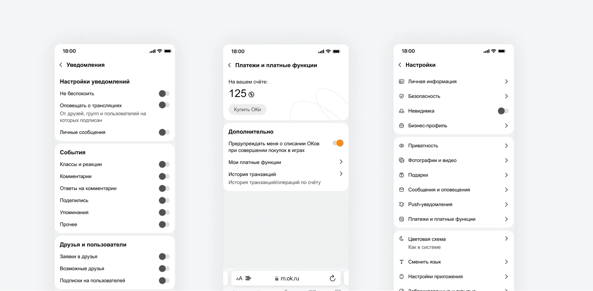
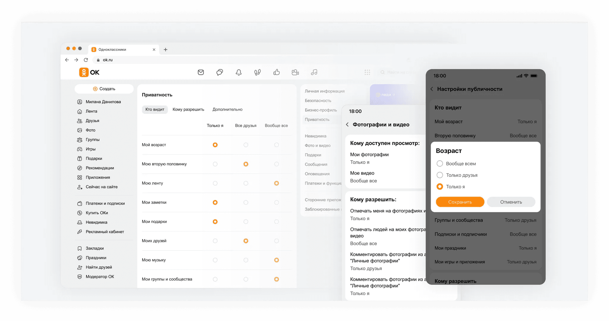
The product is a social platform with an extensive settings section covering profile, feed, privacy, notifications, paid features, and themes. The section had grown organically over time and lost its logical structure — users struggled to find what they were looking for.
Problem
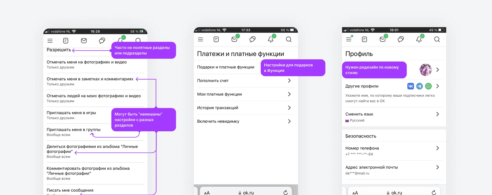
The support team was seeing a consistently high volume of requests following the same pattern: “I can't find setting X.” The feature existed — it was just buried in a non-obvious place.
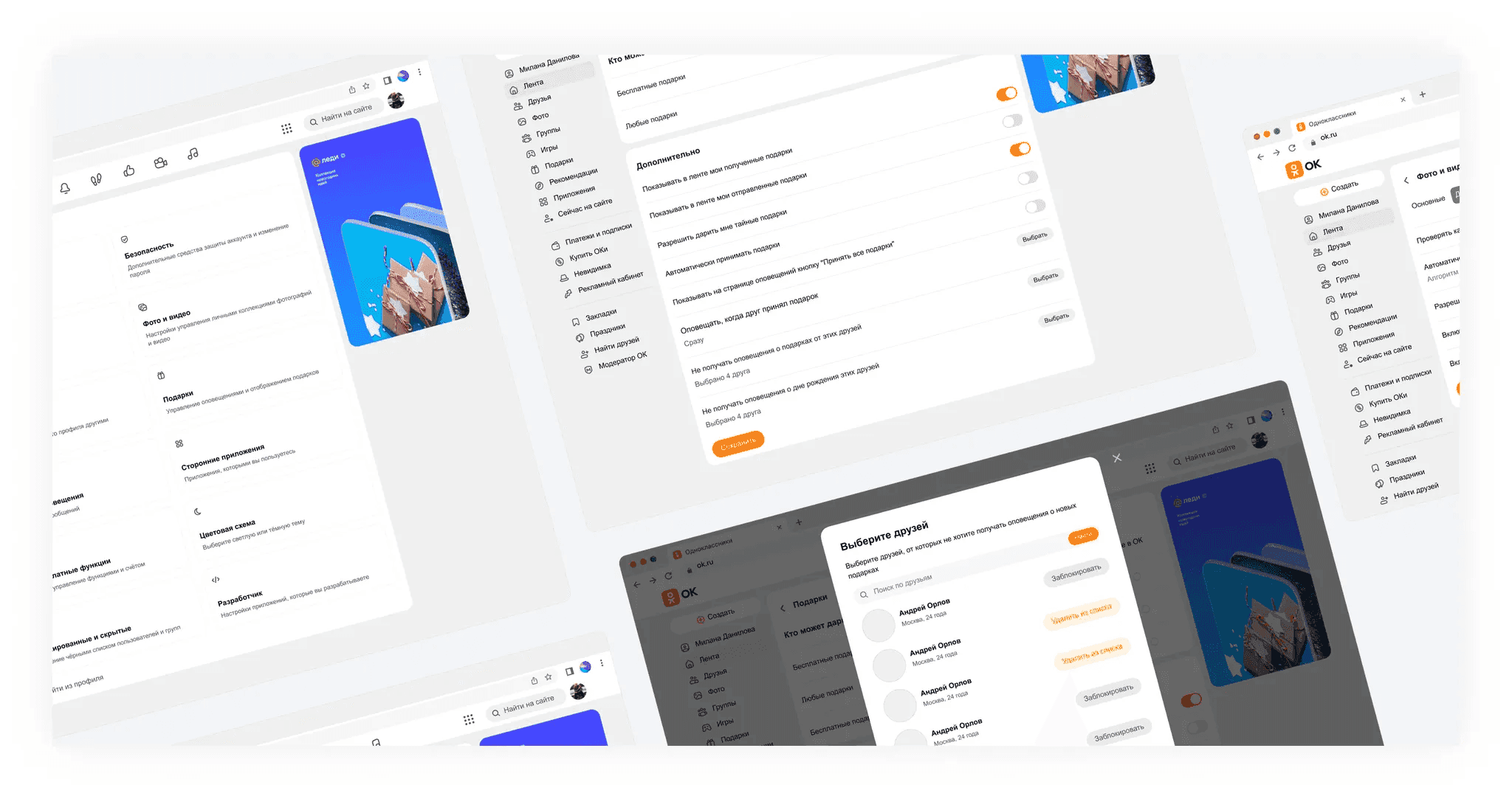
At the same time, a persistent navigation menu was being introduced across the entire site, occupying the same space previously used by the settings sidebar. This created a conflict: the task wasn't just a visual refresh, but a full rethink of the section's structure.
Key questions
- How do we regroup settings so users can find what they need without guidance?
- How do we integrate the section into the new navigation system without losing usability?
Process
1. Audit and hypotheses
Started by analysing support requests to identify the most problematic settings: notifications, privacy, gifts, paid features, and theme switching. These were redesigned first to validate grouping hypotheses before committing to a full redesign.
2. Usability testing
Together with a UX researcher, we ran moderated usability testing on the mobile web version. Participants completed scenario-based tasks using test accounts. The sample included both experienced platform users and newcomers — to verify the new structure worked across both groups.
The new grouping felt intuitive across all segments, giving us confidence to move forward.
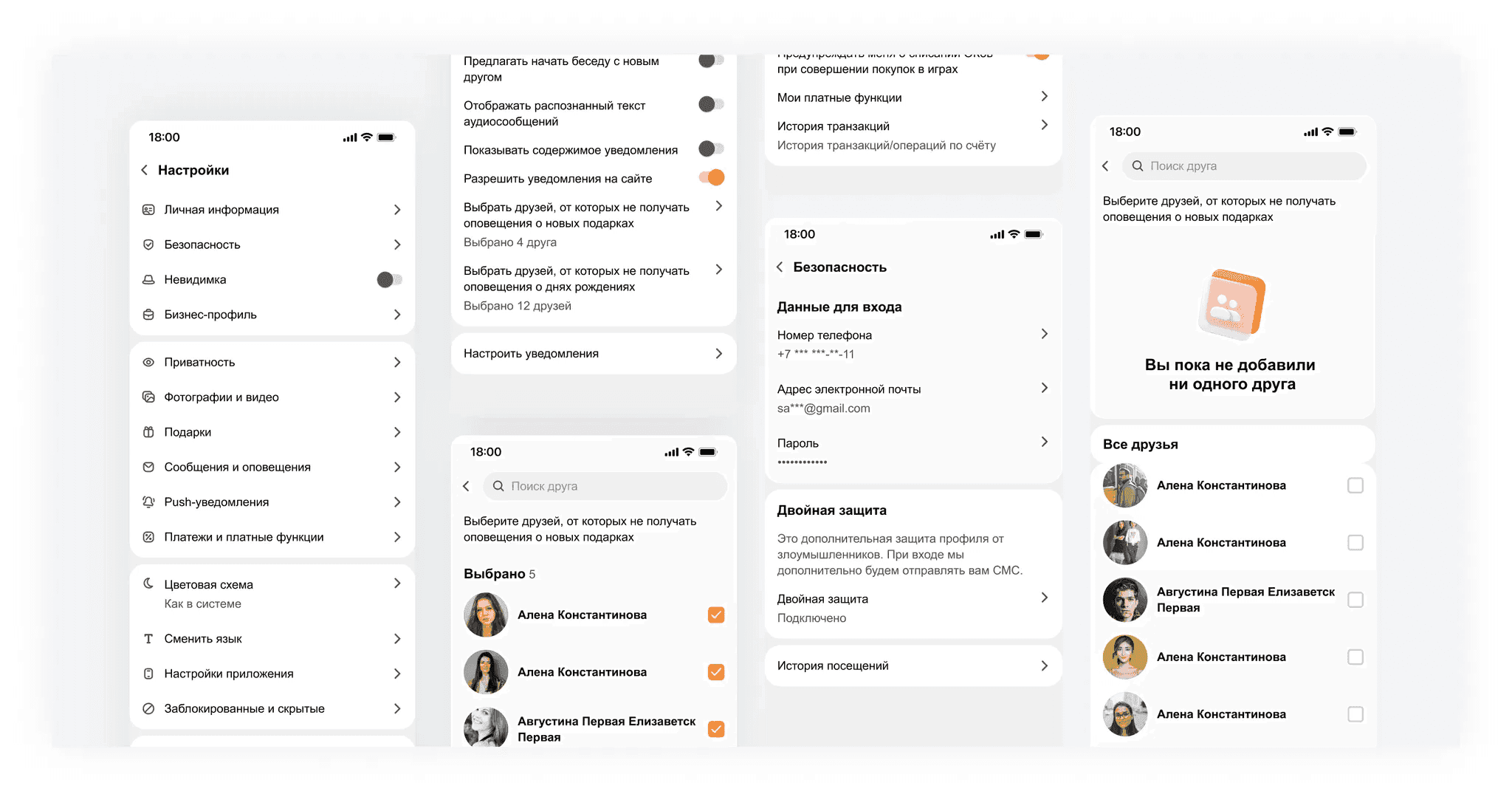
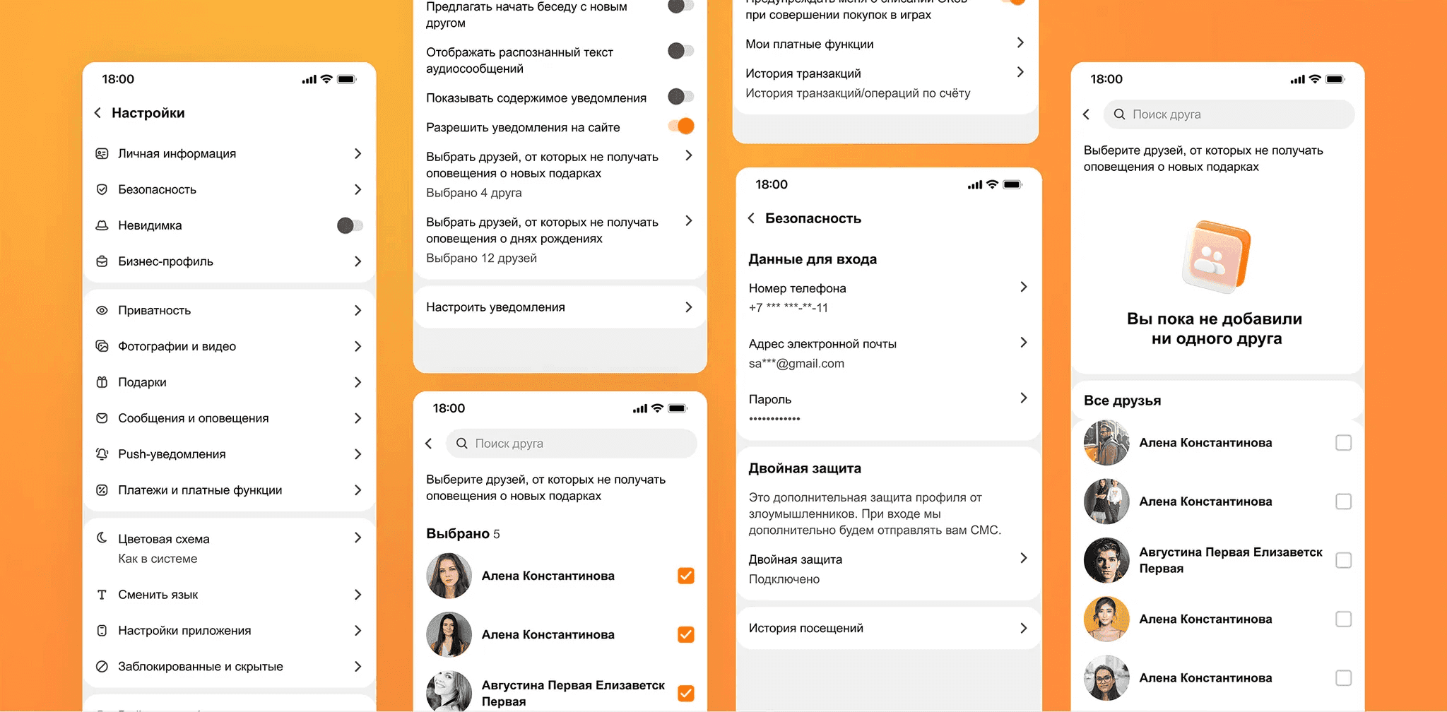
3. Web and Mobile design
Based on testing insights, I prepared mockups for both platforms: persistent menu layout options, patterns for selecting and editing personal information, and an updated visual language for the section.
Solution
- Persistent navigation menu — integrated into the settings section without losing access to subsections
- New information architecture — settings regrouped around user tasks, not technical categories
- Unified design language — updated visuals aligned with the rest of the platform
Results
Task completion rate in testing was equally high among both experienced and new users.
−20% complaints about interface intrusiveness and confusion compared to the previous period.
Persistent menu successfully implemented with no regression in settings navigation.